Drawing out the Archive

The following essay was originally published in the catalogue for Vault: The Non-Stop Performing History of Circus Oz, on at the Melbourne Festival, October 9-26, 2014. Download the catalogue here.
Screen Shot 2014-10-14 at 9.50.37 am

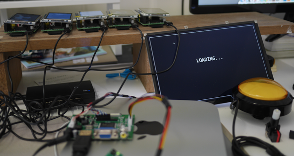
Last Friday, I spent the whole day trying to get a button to work. And yesterday, I spent 6 hours trying to get the small computer that made said button work start a simple program when it powered up.

Last Friday, the situation was: I had a button (in fact, a small electronic switch known as a ‘microswitch’), wired to a small computer known as a ‘Raspberry Pi’. The switch, when pressed, completed a circuit which, via a General Purpose In Out (GPIO), told a small program, running in a programming language known as ‘Python’, that the switch had been pressed. The program executed, and when I pressed the button, the program let me know so by printing out a button pressed message to a ‘console’, in an aesthetic approximation of what ticker-tape must have been like back when ticker-tape was a thing.

Also running on the computer was a program written in a language known as ‘Javascript’. This program connected to the internet, loaded a random entry from the Circus Oz Living Archive database, selected three words in sequence from a closed set of database fields, switched all the pixels on a screen connected to the Raspberry Pi to a bright pink, and then switched some of the pixels to black so that the three words were displayed — with sometimes surprising, amusing results. “Introduces with monologue”, “and steals his”, “skull hat dance”.

The problem I was having was in getting the two programs communicating with each other. What was supposed to happen was the switch in the Python code was meant to trigger the loading action on the Javascript program. You press the switch, you get three words. Simple enough.

I can’t explain here exactly what took me so long to get this working. Partly because of space issues in this catalogue, but partly because I’m not quite sure myself. It involved deciphering long, complicated online forum posts (written with a lot of assumed knowledge), downloading software and ‘code snippets’, cutting and pasting and moving code between text files in directories named /etc/ and /home/pi/. I googled combinations of words that looked oddly like my program’s output: “raspberry pi GPIO xinit chromium”, “python stdin simulate keypress popen”, “startx uinput bug”. I seriously considered buying a USB keybord, cutting it with a grinder so that it was only one button, and using that instead.

I did get the Dreaded Electronic Button working late Friday afternoon, and took a much needed rest on the weekend, tidying the garden, sanding and painting window frames in our new house.

Back in the studio on Monday, I faced another issue: I could make my programs start by invoking them manually, (typing code into the ‘command line’), but I couldn’t get them to start automatically when the computer booted up (an important requirement for this exhibition: what would happen if the power went out, or if we wanted to power down the exhibition overnight?) More specifically, I could get the programs to start, but I couldn’t get them to show on the screen. One program at a time? No problem. Both? For some reason, impossible. I began again… reading forum posts, copying and pasting code, downloading software, googling sentences that, had I said them out loud, you would have assumed I’d had a mild stroke.
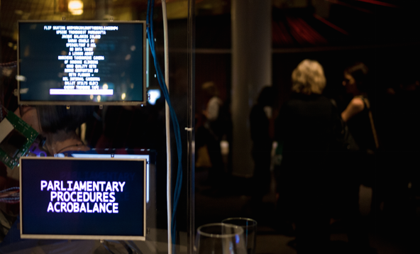
Screen Shot 2014-10-14 at 9.50.16 am

Bret Victor calls programming ‘blindly manipulating symbols’: unlike a painter who manipulates paint directly on a canvas, when programming one writes in symbolic code, which is computationally interpreted to produce an output which is made of considerably different stuff: electrical signals, light, pixels, actions. Victor argues that the inherent blindness in the programming systems that we use today acts as a hindrance to art in that it separates the creator from their ideas by putting up technical barriers. In my PhD thesis (which I completed while working closely with archive of digital videos that made this exhibition possible), I argued that this ‘blind manipulation’ is occasionally beneficial if using coding to design new things, in that it can produce unexpected outputs and serendipitous discoveries. But in the Case of the Electric Button, this blind manipulation was only frustrating. I knew exactly what I wanted, and my poor understanding of the tools at my disposal was only a barrier to my practice. And I couldn’t even really tell you what I learned from the process, other than for my particular odd set of interacting elements, some things have to be in this order and not in that order in order to function. The resulting piece of art produced through this described effort is the Poetic Randomiser, a ‘act’ in our exhibition which, in the end, could be though of as little more than a simple joke about data integrity.

Examples like the one above demonstrate how ‘the idea of software’s “immateriality” is ultimately trivializing and debilitating’.  Sure, code is really just 1s and 0s, code doesn’t ‘exist’ in a physical space. But when you are ‘coding’ your code is always supposed to perform actions in the real world. And those actions are determined by computational systems — both hardware and software — that are largely out of your control.

My experience with programming, as an interaction designer, software developer, and in producing computational art and artefacts, has been largely hardware agnostic: focussed on making things using common technologies with online distribution. Vault is my first attempt at working in a physical space where factors such as power outages, auto-startup, and hardware switches matter to any great degree. This exhibition is touted as the ‘non-stop performing history of Circus Oz’, so it’s non-stoppiness matters, and the code that makes it non-stop has to not-stop. And someone has to write this code, even if it takes hours of frustration.

One of the things about circus is that they never tell you what is difficult and what is easy, what is real and what is fake, or what is risky and what is safe. What might look simple in our case often relies on a fragile collection of unstable hardware and software, internet connections and databases: messages from one part are sent over the internet, around the world, and back to a screen in the next room or (in one extreme case) mere metres away along a wall. It could all come crashing down at any moment. This makes the exhibition a code space, a physical space inseparable from the code that makes it operate.

The material that makes up what I have described is what I would call an interpretive code layer, imposed by us on the archive to draw out, highlight, or, as Ross Gibson might say, activate the archive in new ways. The archive is made of material too — performances, or videos of performances, or descriptions and metadata, or 1s and 0s, or hard drives (depending on your perspective, and what you plan to do with the stuff). The digital archive stores data, and makes it available for use, but code and computational hardware is required to activate it.
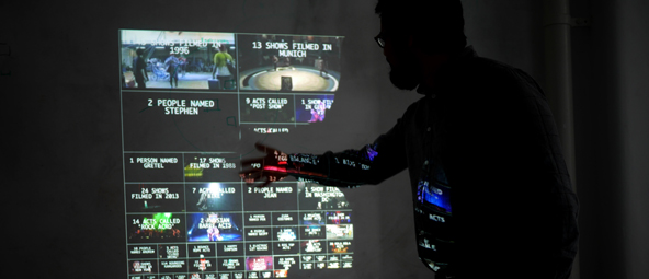
P1070687-2

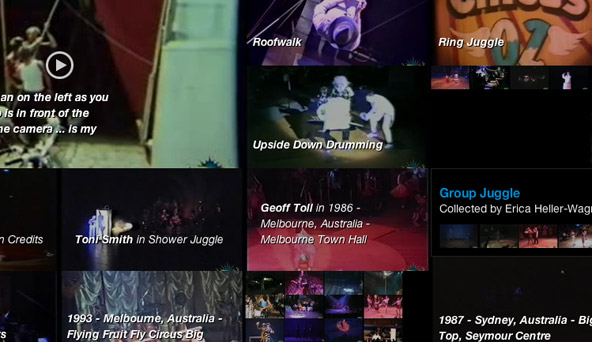
Our approach to this activation has been to eschew the allure of so-called ‘big data’ approaches to the archive. Instead of taking our data set and examining, analysing and visualising it in terms of its aggregate — as is the temptation — we decided to use the gallery space to represent the archive by showing its individual items, fragmented, and juxtaposed. The circus is made up of fragments, (whether circus acts, or tricks, or gestures, or sounds). And the archive is comprised of these fragments too, each one unique and important. Our performance in this space is an act of representation, revealing what was already ‘there’ in the data. What the digital material of the archive offers is an opportunity to play with juxtaposition and scale — to perform a new history of Circus Oz by re-composing elements of their history as recorded. Various works, such as the History Teller, the Wall of Wonders, or the Marathon of Marvels take the ‘same’ data, but computationally represent it in vastly different ways, some more fragmented than others.

I think it is telling that, despite the freedom to manipulate the digital, we haven’t compromised the integrity of the digital videos to any great degree. Low resolution GIF encoding brings a certain broken, glitchy, lo-fi quality to some elements (I see this as little more than an update to the badly-tracked VHS quality of the original recordings), but where the videos are shown they are still shown ‘intact’, if sometimes dramatically edited. Montage and juxtaposition of words and images create new work, but the performers are still there, on stage, recorded in the past and represented in the now. I think we still want to be deferential to the physical work that has come before us — afraid to re-encode, to de- code, to potentially destroy what makes these images those of Circus and not Some Other Thing.

So though we may present the ‘performing history’ with computationally complex systems, activating the archive by making new work out of old, we still care about the ‘truth’ in the fragments. Our code-space is an interpretive one, and I hope that by drawing attention to particular events, or particular phrases, or particular facts, or particular gestures, we are drawing attention to that which was — and is — made by real people, real bodies, in real space.
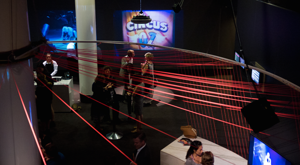
Screen Shot 2014-10-14 at 9.51.25 am

Mediums and messages

Last week, I saw this tweet:

The article that it links to is entitled “Washing Machine for Men: Redefining Washing Machine User Interface”, written by Peter Fabor, posted on Medium.

Now, Medium is not ‘the Onion for tech & design’. It is supposed to be a ‘beautiful space for writing’, and ‘a new place on the Internet where people share ideas and stories that are longer than 140 characters and not just for friends’. I don’t think Medium is supposed to be satirical, and I’m pretty certain that the aforementioned article isn’t. No, I’m sure that the writer of “Washing Machine for Men” is truly, awfully serious.

You can think whatever you like about the content of the article itself. I think it’s ridiculous, a symptom of what often passes for ‘User Experience Design’ at the moment: poorly researched, extrapolated from personal experience, and with no real sense of how the designed objects are actually used in the real world. Plus some (however well-intentioned) outright sexism for good measure: “imagine, that your washing machine talks with you as your mom does”.

But that, in and of itself, is not what interested me about this article. What interested me was the fact that the tone of Medium as a writing and sharing platform gives this article (and all others on Medium) a  weight  that lends a certain credibility to the writing. Medium looks like an ‘official’ tech-industry publication in the same way that the Onion looks like a real newspaper.

Medium began as an exclusive invite-only platform (a strategy which, I assume, was intended to set the overall tone of the content for the publication), but it has since been opened up to the general public. What this means is that now, anyone can write there, on whatever they like, and share it with the world. Medium looks beautiful, or at least, it looks very on-trend when it comes to current perceptions of screen beauty in web-design. The images are large, the typography is thoughtful, the way comments are displayed (which can be done per paragraph) is a clever interaction pattern. The ‘written by…’ (complete with avatars) and ‘published in…’ make it look like the writer is a contributor to an exclusive online magazine. It looks as if the writer has been invited to write the article.

@iamdanw‘s tweet is a joke, and it’s a joke because of this juxtaposition: Medium helps tech industry writers seem credible by utilising the Medium’s stylistic tone which, inadvertently or not, gives the writing a credible tone, deserving or not. 

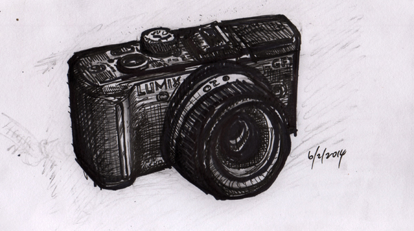
Cameras I own: Lumix GF1

lumix

Part 6 in a series.

I think I’ve taken more photos with this camera than with any other I’ve ever owned. Why? A few reasons. Let’s see… it’s digital, it’s small, it has interchangeable lenses, it looks cool…

P1120152

Otway State Forest

_1050735

Magnolias at the Alhambra, Spain

But maybe, just maybe, the real reason is that it takes great photos. The GF1 is from the first generation of ‘micro four thirds’ cameras: a mirrorless, interchangeable lens system that allowed for very high quality fixed lenses on smallish digital camera bodies.  I bought the Lumix in an attempt to find a digital equivalent to the Hexar, and it ticked a lot of the boxes, most of all Panasonic’s excellent 1.7 20mm lens (which translates to about a 40mm full frame equivalent). Small, light, fast, and a slightly wide angle, just like the Hexar, though not quite as sharp. It was marketed as a kind of small camera for DLSR users, which meant that it had a bunch of semi or fully manual modes, and physical external controls (which I liked).

_1060646

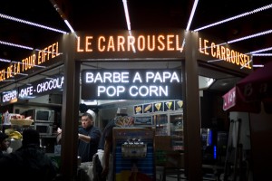
Popcorn at the Eiffel Tower

_1050546

A stray dog in Madrid

The fast lens made the Lumix very versatile as a travel camera, as it meant that I could take good a photo in just about any lighting conditions. It’s a bit of a noisy camera (the shutter makes a very audible ‘clunk’), which makes it a little conspicuous for street photos, but not too conspicuous.

_1060823

Paris, France

_1050480

Zaragoza, Spain

These days, the Lumix tends to stay in the house and be used for documenting, be it food, gardening, tinkering, or the occasional family event. The Lumix has been to Spain, France, the UK and the USA with me, but the iPhone has really taken over in the travel photography department, just because it is always in my pocket.

P1120150

Seagulls off Geelong Pier

_1050818

Ronda, Spain

I’m actually pretty certain that this will be the last dedicated digital camera that I’ll buy. The way that camera technology is going, it’s getting harder and harder to distinguish between the photos from the Lumix and those from my iPhone: just like Craig Mod wrote in his excellent article about this camera/phone convergence, I looked very closely at the Sony RX 1, and even convinced my sister to buy one, but just couldn’t justify another camera that was so close to both the Lumix and my phone. 1

I’m not going to get rid of this camera though. I’ll keep using it, whenever I’m sure my phone just won’t do the job.

  1. I should not have looked back at that article while writing this post… that is what good writing on digital photography looks like. 

The collecting impulse

I found this quote while sifting through some of my old notes for my PhD research (I’m almost finished writing, and thought I’d better go back to see if I missed anything).

A picture in an album has a different function to a picture in a shoebox. Both are building blocks for personal memories, yet whereas the album is formatted as a narrative, the shoebox is a deliberately unsorted collection. 1

The idea of ‘sorted’ vs ‘unsorted’ collections stopped being so directly important for my PhD a while ago, but it is something I want to come back to… I think it has a lot of relevance for how we use technology to manage things like photo collections, or collections of any kind really. The default mode always seems to be sorted into narratives, I wonder why this is?

  1. Dijck, J. van, 2007. Mediated memories in the digital age, Stanford University Press. 

Beautiful interactive storytelling

Screen Shot 2013 08 16 at 4 48 09 PM

… in a game (yes, a computer game) with no guns, no puzzles, no violence of any kind. It just tells a great story, and rewards your curiosity. Gone Home is wonderful example of what is possible with the genre, and makes me feel good about games again.

Play it! (Especially if you grew up in the 90s, there are some great nostalgia inducing details). 

Blindly manipulating symbols

This is an interesting presentation from Bret Victor, with some great ideas for how we can support new kinds of data-driven visualisation in software design (with many implications for the design of other ‘programming’ tools):

The whole video is interesting, but the thing that really stood out for me was his statement that “programming is blindly manipulating symbols”.

Blindly manipulating symbols. What he means, of course, is that programming is an abstract (or indirect) activity. When you draw, you put a pen to paper, where you place the pen is where the line appears: direct manipulation. When you program to ‘draw a line’, you are writing a set of instructions that must be interpreted by both software and hardware in order for a line to appear. What you manipulate (the code—symbols) is not what you produce (the image—a line). Programmers don’t know (they can surmise based on experience, but can never be sure) what the output of their programs will be.

For Victor, this is a problematic situation, in that it removes the directness of thought process that is manifest when working directly, in a material way, with the final artefacts of your production. (This was further elaborated in his earlier presentation ‘Inventing on Principle‘). I agree with him on this point, that in most cases, indirect manipulation is a hindrance to idea generation. 

What I want to say about the design that Victor presents here though is that while his work does make ‘direct manipulation’ easier, it hides a code/generation process behind the interface. Although direct manipulation is made more available for those who don’t need to learn to code, it is still only ‘direct’ within the technological limitations and UI affordances imposed by the designer of the software.

This is, of course, not to criticise Victor’s work, I think it’s incredibly valuable (and as he says, it’s just a starting point to get ‘tool makers’ thinking along these lines). Now, I’ve spent a lot of time over the years blindly manipulating symbols. And there are times where such blind manipulation can be valuable, especially if what you are interested in discovering is the  limits of the particular software/code/hardware system that you are working with. Behind Victor’s interface, the ‘blind manipulation’ is still going on, it’s just hidden from the users of the tool. (This is of course normal for software, hardly any users of software ever interact with the code in any real way). 

Writing this has sparked this incomplete thought: I wonder if there is some point in between what Victor presents here, somewhere between ‘blind manipulation of symbols’ and ‘direct manipulation’ that could allow for a level of experimentation at both a direct-drawing level and a code level? Hypercard?


Improvisation and medium

Aleph

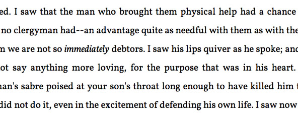
I found one of those projects that was caused of those ‘why didn’t I think of that?’ moments. It’s “The Aleph: Infinite Wonder / Infinite Pity“, a ‘modern’ take on the Borges story. The project takes random sentences from the Gutenberg archive and Twitter that begin with ‘I saw…’ and strings them together into a strangely coherent mass.

It is so simple that it’s a wonder that it didn’t already exist. What I love about it is It uses a very basic metric to slice across a huge cross section of data, and presents it in a way that is compelling and beautiful. In some ways it is (more) effective than the Borges paragraph that it references, because of the way that it really does seem infinite: the awful UI paradigm of infinite scrolling has finally found an appropriate implementation. Combining literature and Twitter it gives a strange, otherworldly sense of immediate and historical. It de-contextualises then re-contextualises to create something new, but maintains an implicit reference to something real in the world. The only thing that could make it better would be if every sentence linked back to its origin (though this may, in fact, break the otherworldly nature of it.)

It reminds me of a very old (please be kind) piece of collaborative student work that I was involved in: violence of text, in which, at one point, we took an essay about the ‘epigram’, and reduced it to an epigram by reducing the length of the text on each scroll through. Simple and kinda silly, but it has some interesting parallels; mostly in the way that the interface presentation is an essential part of the aesthetic argument of the piece. The interface is not a content container, rather, the interface is part of the rhetorical argument as to how the content should be understood. The interface is performative.

When I reflect on the digital work that excites me, I feel like I’ve actually been doing the same work over and over again for the last 10 years, without even realising it. I enjoy taking data (streams, databases, networks etc) and re-presenting them, using interface design, in ways that the data-designers never intended (assuming data structures were even designed at all) . I want to show data out of context, I want to show data in new contexts. I want to use systems designed for temporal presentation (blogging software is the obvious example) and use it to present other, non-temporal structures. I want to take metadata and make it the presentation metaphor. I want to take comments and make them the descriptions. I want to take tags and make them the content. There is something here about improvisation, something about playfulness, something about rethinking norms in interface and presentation, while staying within familiar paradigms. It is struggling against a medium, but pushing lightly and with purpose.

Guitar4 44 AM

When I talk about music composition, I often tell people that I like that my guitars have ‘character’, that I need to ‘fight’ them. This feels related to my design practice in ways that I’d never considered before. I like improvising by ‘fighting’ my guitar; and I like coding/designing by ‘fighting’ a database. I like pushing against boundaries to create something ‘beautiful’. With the guitar, the instrument and it’s inherent character is the medium; with software it is code and the code’s interface with other software and hardware. But the process and goals have similarities. My adeptness with each seems about equivalent. I have a certain defined repertoire and as a result I repeat myself a lot, but sometimes I surprise myself with something unexpected and wonderful. Sometimes these unexpected wonderful outcomes are a direct result of my in-adeptness: in the fight against the medium the medium ‘wins’ in a sublime way. Could this be an argument against Bret Victor’s ‘inventing on principle’? Maybe there is a genuine benefit  in working in a medium that is unwieldily and difficult to master. When I can’t immediately manifest my ideas, I end up with outcomes which are substantially different from what I would have got otherwise. It is a combination of my repertoire and my exploration of the nature of the medium that produce the final outcome. It is not a process of inspiration and production, but it is not totally uncontrolled either. The process is exploratory and improvisational.

This thought feels unfinished — I’m not really sure where I’m going with it — but I’m finding these connections between music composition/improvisation and interaction design a really interesting  space that is certainly worth more exploration, especially regarding my PhD research, where I’ve become interested in the specific actions that designers can do to actively encourage improvisation within complex, cross-disciplinary design projects.

Research outcomes, ‘live’ and ‘real’

Screen-Shot-2013-03-07-at-10.27.23-AM

The Living Archive project — the project that has taken up all of my time for the last 2 years, the project that takes up so much time that I haven’t even ‘bothered’ (according to one unhappy customer) to update my one iPhone app to work on the slightly larger screen of the iPhone 5 — is now ‘live‘.

‘Live’ is a funny word to use really. The Living Archive prototype, in some form or another, has actually been ‘live’ online for over a year. What ‘live’ means here is that the current version, the ‘new’ version, is accessible to the general public, to the world, unrestricted.

I have a few qualms about this ‘liveness’, mostly hold-overs from my former life as a professional web and software designer and developer. Looking at the version that is available to the public, I can’t help but feeling there is so much wrong with it. It is buggy. It crashes. It only works on a selection of web browsers, a smaller selection of phones. It is not optomised for anything. It is unreliable, possibly confusing, underdesigned, unfinished.

The nature of this being a research ‘prototype’ as opposed to a commercial venture is that there is actually years of invisible thought underlying the design. That said, in this particular project, the manifestation of the research through the design is subtle. This is no cool data-visualisation project with excititing visual outcomes to share on design blogs. Nor is it a technologically complex project: none of the technology involved is new, or even remotely groundbreaking. Most of the research is hidden in the processes involved in producing the outcome, and the outcome itself is something of a side-effect of these processes.

The problem—where I perceive it—is that this ‘side-effect’ is the only thing the rest of the world sees. This tension between ‘research’ and ‘development’ presents itself in the project at every meeting, and is becoming more and more explicit as the project moves into a ‘public’ phase. Yes, this is a research project. Yes it is ‘only a prototype’. But people all over the world can use our project as a way of interacting with Circus Oz, a performing arts company with a reputation to maintain. There are so many things that we haven’t thought about, so many design decisions and issues that we decided to ignore because they were not the focus of the research. These things all glare at me, especially when I consider how it might seem to a new user, one who has no idea about the research nature of the project, interacting with the archive for the first time.

On the other hand, for a project that really only had two developers working on it (two developers who were spending most of their time on other, tangential research activity), it’s a pretty good effort. It mostly works, on a selection of browsers. The content is mostly accessible. It’s buggy, but nothing insurmountable. It is a very useful proof of concept of my (and the project team’s) research work. It is a useful tool for Circus Oz. Most of all, it is a useful tool for future research into digital performance archives.

Dan Hill argues in his wonderful ‘Dark Matter and Trojan Horses‘ that “there is a danger in describing projects overall as prototypes, in that it suggests they are in some way “not real”, that they can be turned off, decommissioned”. I agree wholehartedly with this statement. This is no prototype, it is the Circus Oz Living Archive, online, ‘live’, and real.

Writing in public

P1120072

(Don’t worry—not another post about my blog)

I’ve been writing a lot using Google docs lately. As most of my writing is in aid of my PhD, I’m using it for several reasons. It’s common practice in academia to write collaboratively; RMIT (my University) has recently moved all our email and calendars across to Google; using Google docs means my PhD supervisors can keep tabs on what I’m up to, leave comments and make copy edits directly; it makes it easier to share my writing with friends and family for feedback…

One of the features of collaborating and sharing with Google docs is that in any particular document, you can see who is also looking at that document. You can see their name in the top-right corner, you can ‘chat’ (through text), you can even see their cursor and each character as they type. This is great for when you and one or more colleagues are actually working on a single document. 

I’ve had a few strange experiences with this lately though. One is the experience when I’m in the middle of writing and I ‘see’ someone reading the document. Watching me write. It doesn’t matter who it is. Or even if they are actually watching (you see, with Google docs, you can see a name, but you don’t know if they are looking at the screen, if they have your document open in some hidden browser tab, or if they’ve just forgotten to log out). This feeling of being watched can be strangely constraining on what kinds of writing I’m willing to do. It’s like having someone looking over my shoulder.

The other experience is one of watching. Or more to the point, not wanting the writer to know that you are reading. I’ve opened colleague’s documents several times in order to have a quick scan, and felt uncomfortable when I see their name up in the top right corner of the screen. How do they feel about me reading their half-finished work? It’s strangely like reading over someone’s shoulder.

I don’t know what to do about these feelings (other than to not use Google docs). But there must be some kind of happy medium possible between Google doc’s real-time, see-everything collaborative editing, and only sharing ‘published’ updates. 


A much better post than my previous throwaway one, but about much the same thing…

…and not by me: 13 ways of looking at Medium 

What I find particularly interesting about Medium (as discussed in the aforelinked article) is the fact that organises it’s content into what it calls ‘collections’. Actually, not just that it organises content this way, but that the primary view on the content is collections. Not people. Not chronology. Not location. (Though I’m still have trouble separating what Medium call ‘collections’  from ‘categories’ in this context).

I’ve been thinking a lot lately about the assumptions that we have around content organisation online, Medium appears to be something of a shift. A shift to where exactly? Who knows… Anyway, read the article, it’s good.

A sudden realisation of the importance of meaningful control

A few new online services popped up recently — loaded with plenty of hyperbole — that seem to indicate a move towards more control over public stuff online. It’s something that I’ve been thinking about for a long time, and its great to see it showing up in the public sphere. 

First up is Branch, “A new way to talk to each other”. At first glance it is something like a semi-private (invite only) hosted discussion board. Control over participation. I found it especially interesting that “go beyond 140 characters” is touted as a feature — it’s funny what arbitrary restrictions will do to your perception.

App.net provides a semblance of control over development trajectory. It is billed as “a real time social feed without the ads”. Will a Twitter clone paid for by developers be better for developers that Twitter has been recently? 

Medium is “rethinking publishing and building a new platform from scratch”. It comes across as a something of a blogging platform, but rather than being organised by time, posts are organised in ‘collections’. A hosted blogging service with control over organisation?

Looks like a trend to me…

A change in content direction (again)

Another blog post about my blog

I’ve realised (and have been told) that the more I post on this blog regarding my PhD study, the more incoherent and confusing this blog becomes. I need to document my PhD research somewhere, but this blog doesn’t seem to be the place: blog posts are too closely tied to the moment, too personal, too structured around text; and this blog in particular was never set up to be an academic repository of any kind. I feel too constrained by the blogging structure to put up ‘unfinished’ ideas here, and an ‘academic’ style of writing is odd when placed in relation to some of the other contents on here.

To address this issue, I’ve set up a dedicated site specific to documenting my research: http://phd.absentdesign.com. There is not much here at the moment (it is still very much a work in progress), but from now on it will be the go-to place for anything related to my research work.

This blog will now return to being a personal exercise: not so serious, more shorter thoughts and reactions, more of what’s going on with Absent Design and my other software venture, Paper Giant. More blogging.

Small multiples

I’ve seen quite a few examples of the genre of work in the video above (though this is a particularly good one: do watch it to the end). Oddly, I happened to watch it just before reading the following passage on “small multiples” in Envisioning Information:  

At the heart of quantitative reasoning is a single question: Compared to what? Small multiple designs, multivariate and data bountiful, answer directly by visually enforcing comparisons of changes, of the differences among objects, of the scope of alternatives. For a wide range of problems in data presentation, small multiples are the best design solution. 1

Last time I read Tufte extensively was in the context of doing information design work for the ACID/ABC Pool project. Today it is in the context of thinking about how people make sense of information in the context of digital video archives. I’ve been thinking for a while that one of the powerful aspects of the digital video archive is that it can allow multiple visual comparison in a way that physical archives can’t due to the limitations of analogue technology. “Small multiples” is definitely something I want to explore in more depth in the next stage of my PhD research.

  1. Tufte, E.R., 1990. Envisioning Information, Graphics Press. 67 

Rapid prototyping in the real world

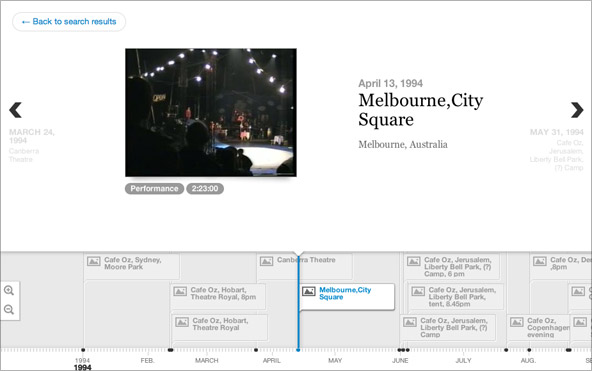
Yesterday I had a quick play around with VéritéCo’s Timeline JS. It’s a great little open source JavaScript library for creating “beautifully crafted timelines that are easy, and intuitive to use”. It is primarily built to load content from various online services like YouTube, Flickr, Twitter and the like; but because it is open source JS I was able to hack it to get it working with the Living Archive prototype. 

One nice thing about working with a collection of performance videos: every performance — and subsequently every video — has a date. The performance, and the shooting of the video, happened at a particular time. And, luckily for us, we have most of that information in our data set.

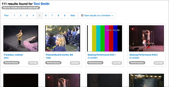
So: having time/date data accessible, and having some open source code to work with, means that it was relatively trivial 1  to take a set of search results like this:  

0 ss1

And display them like this:

0 ss2

(The Circus Oz Living Archive is in closed alpha at the moment, so I can’t link to a working demo, but I hope you get the idea). 

I was talking to Adrian the other day about the flow and direction of the project, especially the challenges of deciding what to focus my development energy on. He noted that in the environment in which we are researching (online archives, digital video, digital storytelling etc), the rate of change is so fast that we can’t possibly compete on a technical level with commercial organisations devoted to these things. And my PhD is not even about technology per se: I’m not trying to come up with some advanced or innovative technology, and I don’t see that we have that capacity in the project team. Drawing lines between commercial work, commercial research, and (what Adrian has called) ‘research research’ is a constant struggle in the project.

In that context, what I like about using a ‘live’ prototyping technique is that it utilises existing, free, technical solutions (we’ve been doing this all along:  Kaltura, Twitter Bootstrap, and now Timeline),  which means that we don’t have to do a huge amount of technical work in order to answer a “what if you could…?” question: 

Q: What if you could view search results in a time-based interface?

A: Here, try this.

I would argue that a live working prototype (using real code, in a real environment) takes us much closer to an answer than any kind of static design, paper prototype, or prototype that uses a ‘test’ data set. What I’ve built with Timeline JS is certainly not the only answer to this question. It’s probably not the best solution. In fact — and here is where my thoughts start to get convoluted — maybe it’s not an answer at all. Maybe the prototype is really a tool to help us ask better questions

What I’m getting at is something about the importance of prototyping in real (not idealised) situations, and the fact that designing ‘in the real world’ throws up questions as well as answers. It’s a bit of an incoherent thought for now 2, but there is something in there that could give me a new perspective on my PhD work so far, and a clearer idea of what I’ll be working on for the remainder of the year.

  1. It took around 3 hours to get it all working. For the technical amongst you: I had to modify the source code to always parse the data as an “image” type because Kaltura serves thumbnails without file extensions; I added some extra JSON properties to show video time and type data, and I also made some minor interface changes. The time also involved writing in PHP (a language with which I’m pretty unfamiliar) to get the search results in the correct JSON format.  
  2. It’s actually been a real struggle for me to write this blog post: I seem to only want to blog about That Which I Am Certain. More on this later. 

No more apologies about not posting regularly!

Just More Regular Posting instead! No guarantees about quality.

Rehearsal --> Performance

To get things rolling, some recent goings on…

I presented a few different takes on my PhD research recently, one to the Design Futures Lab at RMIT, another to a panel of researchers for my official PhD progress report. I got some great feedback, and had some interesting discussions about language, about archives, and about the difficulties of doing PhD research as an ‘interaction designer’ in a semi-commercial context. What this also means is that, once some paperwork is filled out, I’m officially half-way through my PhD. That was a quick year and a half.

The Living Archive team successfully launched a live prototype of the Circus Oz Living Archive, and it is being tested at Circus Oz during their Melbourne season. 

An app-development company I started earlier this year with my friend and colleague Chris Marmo has reached round 2 of the RMIT Business Plan Competition. We have an interesting app idea that has developed directly from our PhD research, and we hope to have it out by the end of the year all going well.

I’ve been listening to a lot of Talk Talk lately. Why didn’t I know about these guys when I played in a post-rock band?

Archives